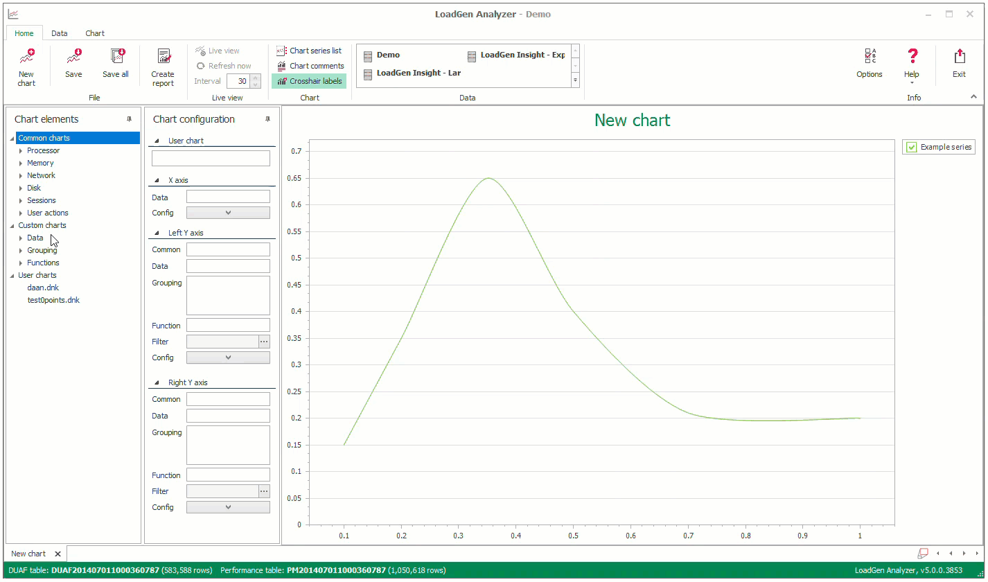
Create a custom chart
The Common Chart option in the LoadGen Analyzer will give you detailed charts based on the default performance counters and Applications (Transactions), and Measurements (Subtransactions). You can of course, create your own charts by creating a Custom Chart. These Custom Charts can be saved (User Charts) and reused with the results of other tests.
In case you want to create a custom chart, follow these steps:
X-axis
- In the LoadGen Analyzer, go to the left pane (Chart Elements) and select the Custom Chart treenode, expand this node:

- Start by dragging the Loadtest duration (advise: Load & Performance Test) or Actual Time to the X-axis
Y-axis
- The second step is to drag and drop either a User actions or Performance metrics element to the Y1-axis. You can also drag and drop another value to the Y2-axis (i.e., to correlate measurement times versus CPU %)
- After you drag and drop the element to the Y1-axis field, you will see the following Filter editor

- In this Filter Editor, you can polish your data to suit your needs. Just click and add fields, and you can zoom in on the result of your built filter
- You can use this button
 to see the actual data based on your filter
 - Press the OK
 button, and your chart will be created
Grouping
If you have multiple measurements with the same name, use a Grouping to create multiple series.
- Drag and drop the Grouping of your needs to the grouping field, and this will give you a detailed overview:
Functions
If you want to manipulate your data, use the Functions option, you can add Average, Moving Average, Sum, and Percentile.
- Drag and drop the Function of your needs to the Function field, and this will give you a detailed overview

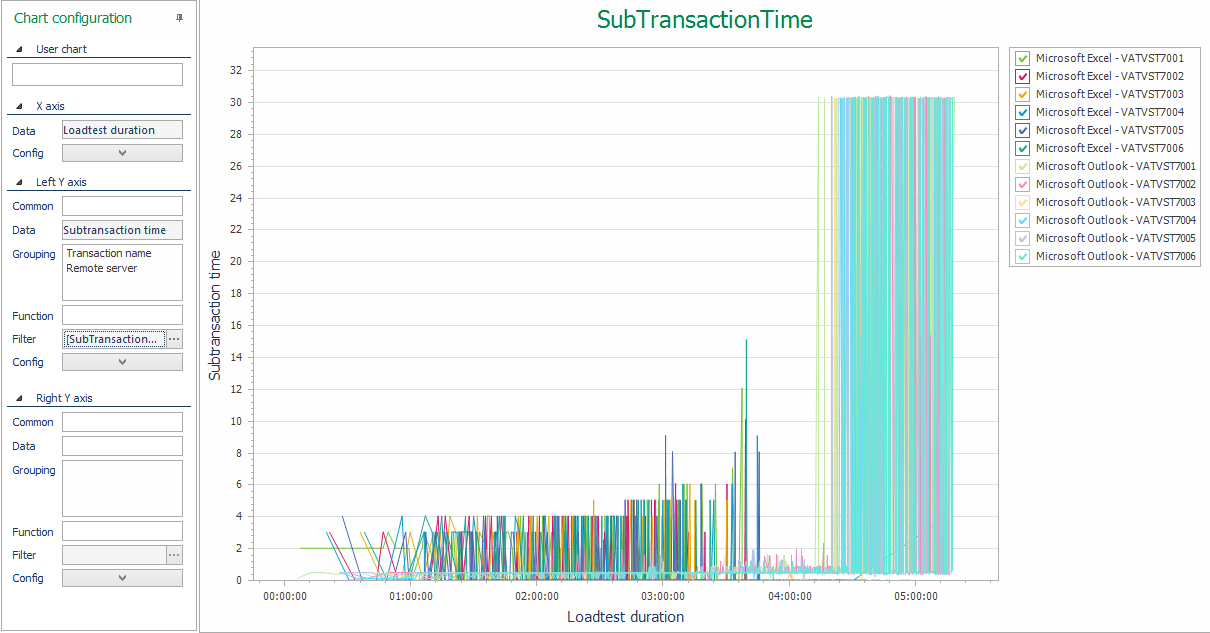
- Let's first narrow the data by opening the Filter of the Y1-axis by pressing:

- This will open the Filter Editor, we will change the Transaction name (Application) to Outlook only and add 1 dedicated server:

- The Custom Chart will look like this:

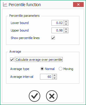
- If we want to normalize this data, we can, as an example, add the Function Percentile with an Average
- Drag and drop the Function Percentile on the Function Field, choose your percentile lower and upper band. Additionally, you can add an Average
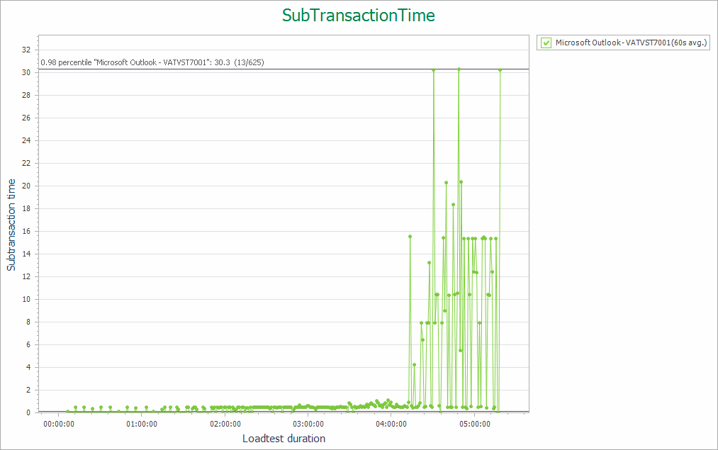
- The following chart will be shown
Video
In this video, you can see the steps for exporting the charts: